
Perspective Blend
Perspective Blend of Eilean Donan Castle
A few months ago, I was fortunate enough to have one of my images critiqued on Patreon by a photographer whose work I deeply respect. It was great to get a fresh perspective on it, although getting a fresh set of eyes on your work, especially from someone you admire, can be equally exciting and slightly nerve-wracking.
Since then, I’ve submitted three more images for critique, two of them from my recent trip to Scotland. The first was a photograph of Allt Dearg Mòr (“Great Red Burn”) on the Isle of Skye. Gavin’s response was immediately encouraging. He said, “I love that. … Love the processing, and I love the composition, and I love this kind of moody light. That’s exactly the kind of what I’m looking for when I go to the Isle of Skye. … Top marks, I would have been very happy with that shot.”
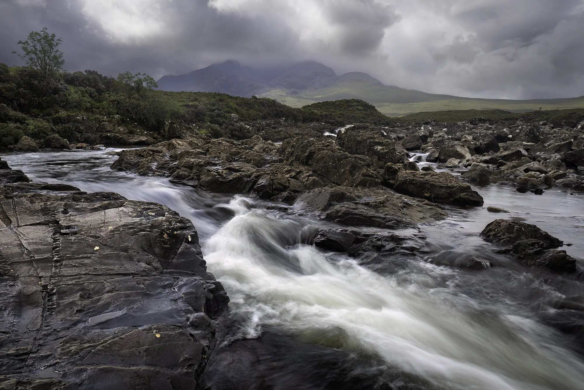
Allt Dearg Mòr
Hearing that was immensely satisfying. Skye can be a demanding place to photograph, and moody light is challenging to manage, so to know that the image resonated in the way I’d hoped felt like validation. One point Gavin raised, however, was about the ratio of foreground to background. Because of my shooting angle and use of a wide-angle lens, the mountains and sky played a relatively minor role in the frame. It wasn’t a criticism as much as an observation, but it planted a seed that would resurface during the critique of my next image.
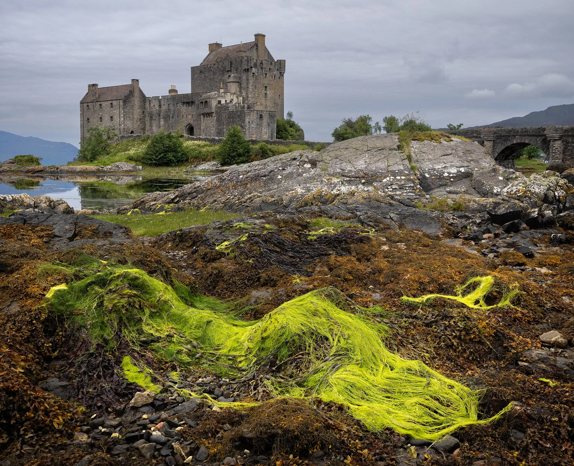
The second photograph I submitted was of Eilean Donan Castle, and it was probably my favorite image from the entire trip. Gavin was again extremely complimentary, particularly about the same qualities I’d responded to when I made the photograph. He said, “I love what you’ve done here with this foreground. … You’ve found this lovely splash of color and texture. That color pops beautifully against this gray. … I love the way you processed it. I love the muted colors. It’s so classically Scottish and moody.”
Then came the “but.” “The problem that I have with this shot,” he said, “is in that finding what is a brilliant foreground, you’ve completely blocked the most important subject here, which is the castle and that beautiful bridge. … You tease us with a little bit of it, but it’s blocked. … You should never allow a foreground element (or a mid-ground element) to block, let’s say, fifty percent of a very, very important background subject.” It was fair criticism.
In my defense, obscuring the castle wasn’t a mistake; it was a deliberate choice. Eilean Donan is one of the most photographed locations in Scotland, and I wanted to make something that felt different from the countless images I’d already seen. I knew the foreground would change dramatically with the tide, so I committed to it fully. In many ways, the foreground was the subject. I was also trying to suggest a sense of narrative, approaching from the water, unsure of exactly what lay beyond the rocks, with the castle slowly revealing itself ahead. With that intent in mind, I felt I’d achieved what I set out to do.
The big however is this: the feedback is objectively good. For most viewers, a landscape image featuring a castle carries an expectation. Ninety-nine percent of the time, the castle is the subject. Blocking it introduces tension, and that reaction is understandable. The image asks the viewer to work against their own assumptions.
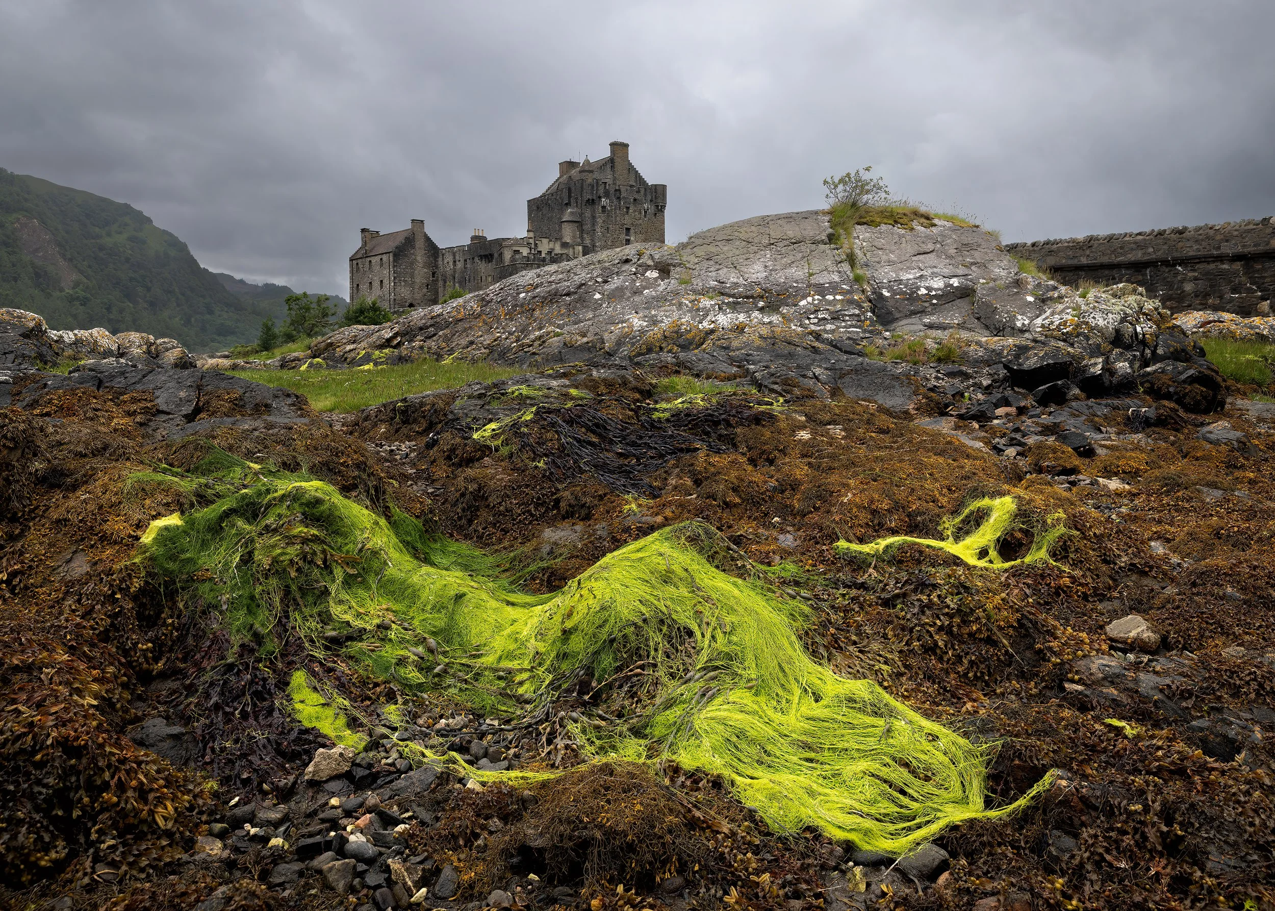
Gavin’s suggestion was something he referred to as a perspective blend. “Ultimately, it’s a composite,” he said. “Because of the way you’ve composed this shot, it should be very easy to cut out this foreground. … You could cut this out and then drop in a new shot—which I’m sure you’ve got—of just the castle with the mountains, and the gray sky in the background, and the bridge, and put them together. It would change your aspect ratio, but that would be the ultimate composition. This foreground and mid ground is superb, and I’m just missing that castle.”
I decided to take the feedback on board and give it a try. Cutting out the foreground in Photoshop was tedious work, but it did exactly what Gavin predicted. The resulting image doesn’t exist in reality. It’s a constructed perspective, an almost a Cubist approach to landscape photography, but visually, it’s undeniably stronger. When I shared the revised version with Gavin, his response was immediate: “Now THAT is what I’m talking about. Great finished results and much stronger :)”
Personally, I’m torn. I genuinely like the new image, and if I were choosing one version for a postcard or a print intended for broad appeal, it would absolutely be the composite. At the same time, I love that the original image represents a real perspective and tells the story I intended when I pressed the shutter.
If I were given the chance to re-shoot the scene under the same conditions, I think I’d aim for a compromise. I’d still prioritize the foreground, but I’d work harder to reveal more of the castle; enough to satisfy both narrative intent and viewer expectation.
So, can we both be right? Probably. Critique doesn’t have to invalidate intent, and intent doesn’t make critique wrong. Sitting in that tension between what you meant to say and how others receive it is uncomfortable, but it’s also where growth tends to happen.
If you’re interested in seeing more of Gavin’s work, I highly recommend his Fototripper channel on YouTube, as well as his excellent book, Stories within Stories.
Eilean Donan Castle, original image